Visualizing Health
Create images to effectively communicate health risk information
More Information
When it comes to our bodies, data abounds. We all have a blood pressure, weight, cholesterol levels, A1c, BMI, and more. We have risks, too. We might have or be at risk for cancer, or heart disease, or have a higher risk of experiencing a side effect of a medication or treatment than someone else.
In theory, this data can help us make better decisions about our health. Should I take this pill? Will it help me more than it hurts me? How can I reduce my risk? And so on.
But for individuals, it’s not always easy to understand what the numbers are telling us. And for those communicating the information – doctors, hospitals, researchers, public health professionals — it’s not always clear what sort of presentation will make the most sense to the most people.
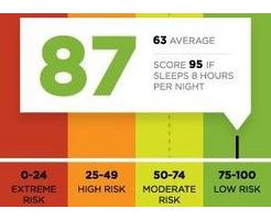
That problem is the inspiration behind Visualizing Health, a project of the Robert Wood Johnson Foundation and the University of Michigan Center for Health Communications Research. This site contains 54 examples of tested visualizations – that is, graphic displays of health information that we’ve evaluated through research among the general public. Our objective was to create a gallery of beautiful and easy-to-make-sense-of graphs, charts, and images that effectively communicate risk information. Health data that makes sense.
Ticket Required: No
Minimum Age: 13
Languages: English
